Oxocarbon Colorscheme
An accessible, high-contrast colorscheme for semantic text editing
The oxocarbon colorscheme was created out of a need for a color scheme that was both accessible and aesthetically pleasing. Most color schemes do not offer enough contrast for people with color blindness, and they can also be difficult to read for extended periods of time.
I am red colorblind (protanopia), and this has affected the way I interpret code. I have found that many color schemes use colors that are too similar for me to easily distinguish between them. This can make it difficult to understand the structure of code and to identify errors.
The oxocarbon colorscheme was designed to address these issues. The colors were chosen to provide high contrast, even for people with color blindness. The scheme also uses a limited palette of colors, which makes it easier to read for extended periods of time.
In addition to being accessible, the oxocarbon colorscheme also implements proper accessibility standards. The colors are chosen to meet the Web Content Accessibility Guidelines (WCAG) 2.1 AA standards for contrast. This means that the colorscheme can be used by people with a wide range of visual impairments.
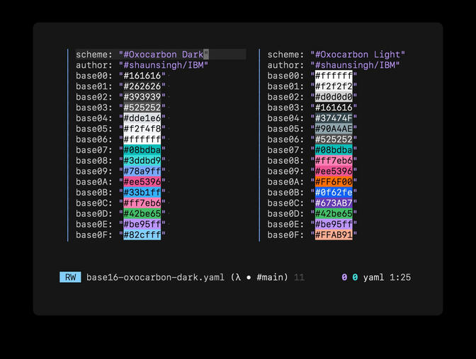
The color palette expands on Nyoom's unique aesthetic and is inspired by a contemporary and ever-changing IBM. Balancing mankind and machine, the colors are harmonious with nature, yet chosen for their luminous quality in the digital world. The oxocarbon color palette is a subset of the broader IBM palette.
The colorscheme is centered around a vibrant set of blues, combined with an industrial set of grays. The full palette extends from the blue family to the edges of the blue spectrum—even the reds contain a hint of blue.
The resulting palette is a set of colors that portrays a singular IBM. Of the world and digital. Useful and judicious. Having multiple gray families gives each design the opportunity for nuance and meaningful moments of color. Each experience should be dominated by the grays and the core colors of black, white, and the blue family, allowing the other color families to have vibrancy and provide purpose.
With every port the goal is simple, give the user as much information about their application as possible while remaining easy on the eyes.
The oxocarbon colorscheme also uses semantic highlighting to improve the readability of code. Semantic highlighting is a technique that uses static analysis to highlight code on intent rather than expectations. This can make it easier to understand the structure of code and to identify errors.
The oxocarbon colorscheme has been well-received by the developer community. It has been implemented in a variety of software programs, including Vim, Emacs, and Sublime Text. The project is now carried on by a group of volunteers who maintain implementations for various software.
I am proud of the oxocarbon colorscheme, and I believe that it is a valuable contribution to the developer community. I hope that it will help to make code more accessible to people with color blindness and to improve the readability of code for everyone.